Color System
Brand Colors
Primary — Invictus Blue
Secondary — Electric Blue
Accent — Twilight Blue
Interface Scale
Seven-step neutral scale. Inverts symmetrically in dark mode.
Semantic Colors
Shown on interface softest — light mode on #FDFDFD, dark mode on #0D1117.
Logos
Logo Lockups
Light variants (artwork is light) shown on Invictus Blue. Dark variants (artwork is dark) shown on white. Transparent PNGs on checkerboard. Missing files appear as broken images.


Sub-brands
Digital Revival


Sub-brands
Rock Cloud
The Premiere Cloud Hosting Platform for Rock. Managed by the highest-rated partner in the Rock community. Trusted by the leading Rock churches.


Logos
Avatar
Compact brand icon for org avatars, profile images, and partner listings.
Personas
Magnus — Mascot
For internal and playful contexts only. Never a replacement for official brand logos.


Personas
Leaders
Partner headshots for use in marketing materials, community-facing content, and internal communications.
Emily Forman — Partner
Emily is a senior leader of Spark and co-founder of the Rock consulting firm Triumph Tech. She enjoys working with the churches and partners that make up the Rock community, and tackles many of the operational aspects of running a non-profit, as well as moderating the RockCast podcast. She is passionate about understanding and connecting people, taking on the hard projects, traveling with her family and changing the world one smile at a time.
Jon Edmiston — Partner
Jon Edmiston is an Executive Director at Spark Development Network, Founding Partner of the consulting firm Triumph Tech, one of the core and original developers of Rock RMS, lead technical architect, Rock community leader, and founding vision-caster of the Rock project. He approaches life with curiosity and a determination to deliver excellence.
Nick Airdo — Partner
Former developer at Central Christian Church (AZ), Nick now works at Triumph Tech as a technical lead and developer. He has been involved with ChMS developer communities since 2004.
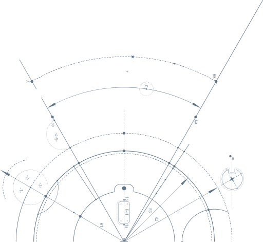
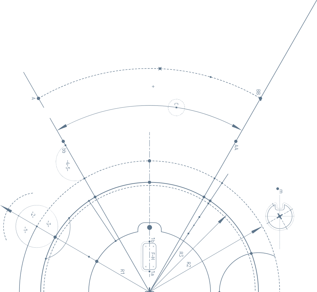
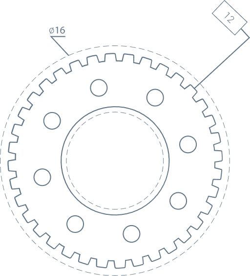
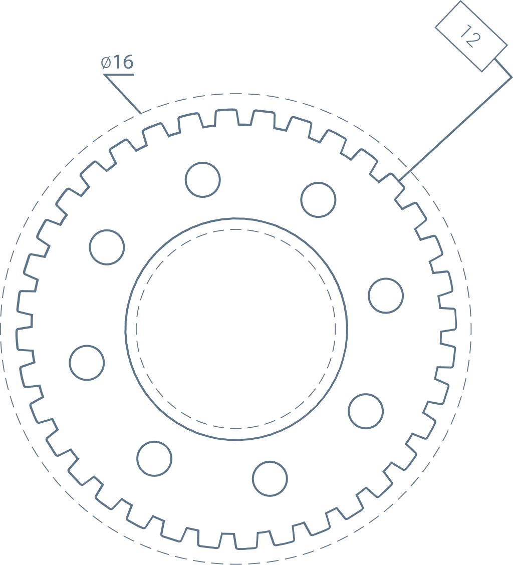
Brand Elements
Embellishments
Blueprint-style decorative elements. Gray — suitable for both light and dark contexts.
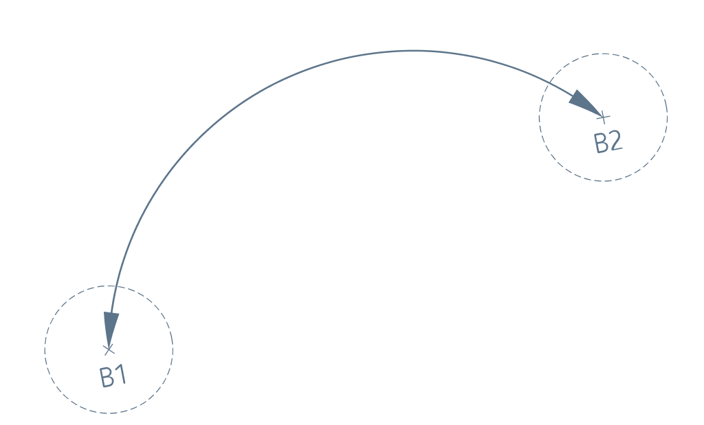
Use at section edges or corners to frame content and introduce organic curvature to an otherwise structured layout. Works well as a transitional element between sections.


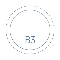
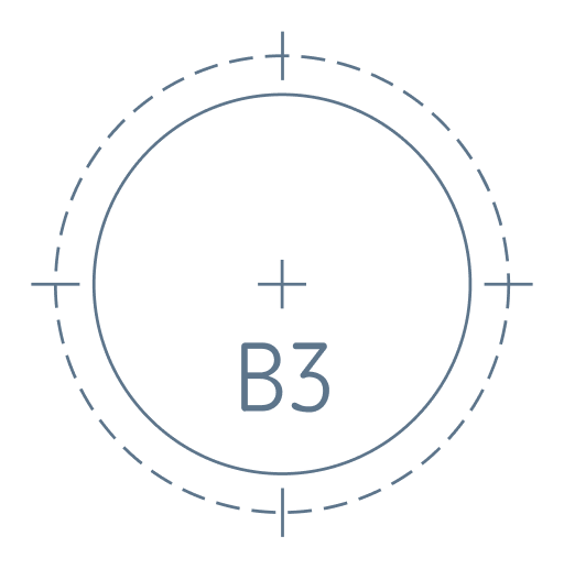
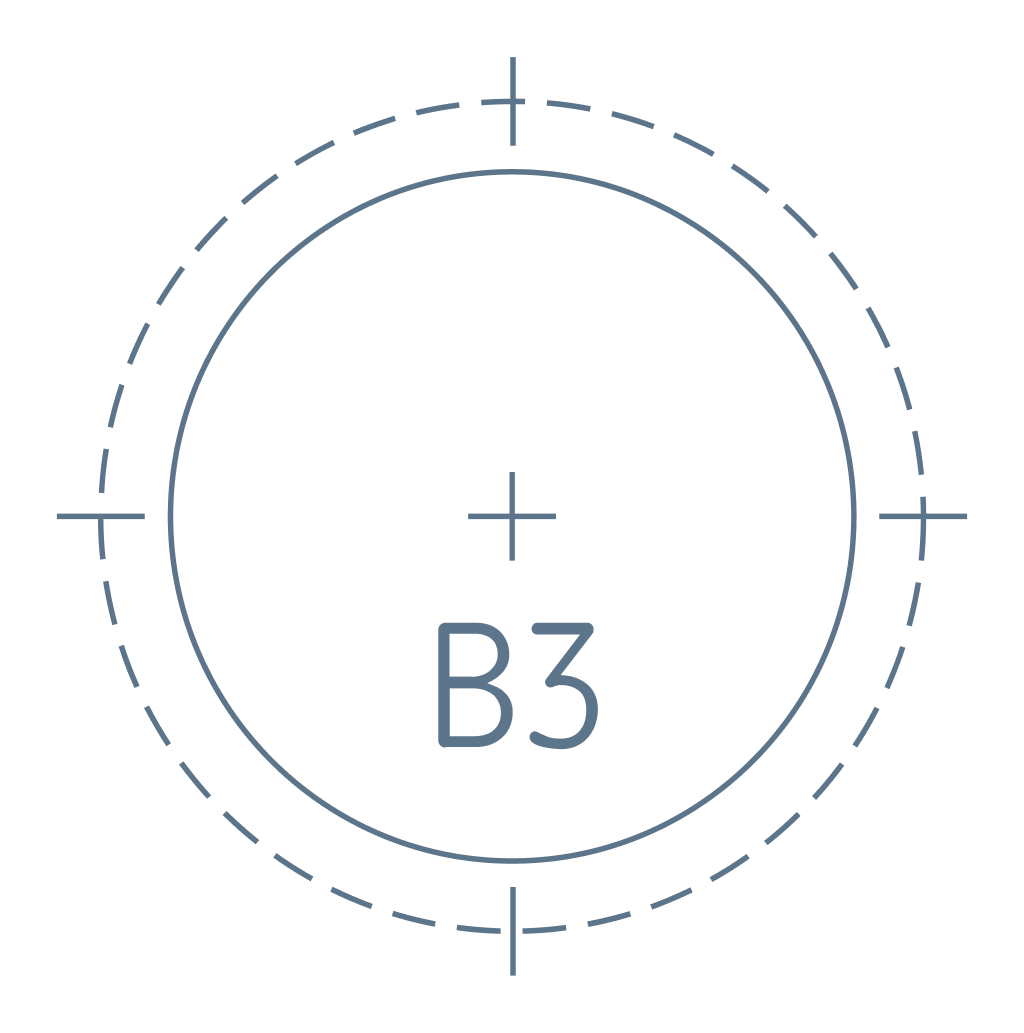
Apply in compositions where technical precision is the emphasis — callouts, data-driven sections, or layouts that benefit from an engineered aesthetic. Use sparingly to preserve its intentional feel.

Place behind hero sections or full-width content blocks to add depth and visual texture. Intended as a large-scale background fill — keep it behind all foreground elements and reduce opacity as needed.


Deploy in technical or product-focused contexts to reinforce themes of process, automation, and innovation. Use sparingly as a supporting detail rather than a dominant element.


Typography
Goldman Sans
Sole authorized typeface for all Triumph Tech communications.
abcdefghijklmnopqrstuvwxyz
0123456789 !@#$%&*()[]{}
Design Tokens